
10X Trainer
iOS App that uses AI and gamified content patterns to train employees for clients across multiple industries in human facing interactions, ie, phone calls, sales
Project Overview
I was Lead UX/UI Designer for Cardone Ventures' iOS mobile app 10X Trainer. Cardone Ventures is a business consulting, investment, and incubator firm co-founded by Brandon Dawson and Grant Cardone. The company aims to help small to mid-sized businesses scale and achieve significant growth by providing tools, resources, and guidance. Cardone Ventures' technology team wanted to take the recent developments with the AI sector and translate them into a training app for sales and other team members to learn from, reducing onboarding needs for new staff, providing real-time feedback with targeted action items, and freeing up time for managers to do other high acuity work. This was planned as an internal tool at first, but quickly changed into a client facing project.
Problem
Cardone Ventures has vigorous onboarding process for its staff, which involves hands on time with managers and senior staff members. However, because of the time-economy of high performing leaders, new staff don't always get feedback on performance quickly, and often have to learn while doing client facing work. This makes training high risk and areas of improvement hard for new hires to catch. Those same problems were often observed in our clients as well.
Solution
I designed a mobile app that allows users to roleplay and be coached from AI trained on company training data, from idea to App Store launch. I started with barebones rectangles that I rapidly refined, ideated on, made a functional prototype, led developer hand-off, and coordinated the creation of a PWA app. My team and I tested the PWA app as a prototype with core users for data and prompt refinement, and then I led my design and product teams in a massive UI enhancement for executive and stakeholder investment. Once buy-in was secured, I did user testing with an Alpha group and generated accessibility and product recommendations. I led a rebranding effort for a complete UI and UX overhaul focused on brand luxury and identity, motion, user engagement, gamification of existing features, new features, and competitive edge for an App Store launch. I wrote databases and directed content design, made Lottie and other image assets, and providing marketing insights for the product team.
Process
Role and Team
Lead UX/UI Designer
3 PM
1 mid-level UX/UI Designer
1 contractor
8? developers
Tools
Notice - this project changed direction repeatedly
This project might look messy. It was tumultuous and difficult to work on. There was a lack of communication and clarity on purpose, execution plan, and value from key leadership individuals, which setback the team significantly.
I'm still proud of it, though. It helped me to grow and forced me to watch the project implode, or take over strategy, project vision, and, at times, fully directing the team. I am simplifying elements of this project so it can focus on the overall design process.


10X Closer
Inception
In mid 2024, leadership handed off to me basic UI and screens which they called "10X Closer." I was asked to help the dev team understand what the designs meant and provide minimal edits, to prioritize "complete and utter speed." The goal was to build this ASAP and identify how real of an idea this could be and what data structure requirements there would be. The core app was to be an AI chat service that allowed our internal sales team members to role-play with a custom trained AI agent.


Designing for Version 1
The UI we were working with lacked crucial functionality, states, interactivity, rules, and looked ugly. While it technically sufficient for a build, my team needed more documentation and asked me to start filling in the gaps. I made minor amendments to the UI and added several quality-of-life items for users who would be testing the app while we proved the value of the concept. This included a brief "instructional" screen (with an animated Lottie) for users before engaging the AI, a better toolbar for users while in chats, and cleaning up the chat UI.


Designing New Features
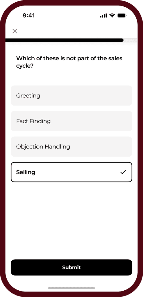
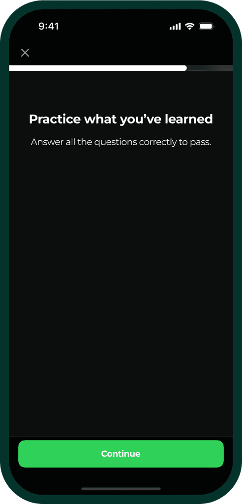
Once the initial PWA app for 10X Closer showed that we could successfully load custom trained agents into an interface with users, team leadership was eager to see what other opportunities we could capitalize on. We were given given new requirements and features to start adding to the app, and a request to improve the UI without changing too much. Balancing both the product team and the developer team, we designed new features and screens intended to be minimally invasive to the app build. This included saved exercises, a new "Today" dashboard that served as the home page, a test/quiz like experience, the ability to learn through flashcards, reading material and content, saved content, a profile experience, and a leaderboard.


Building Design Library V1
To help make the new features possible, and because the project seemed like it could become long-term, I implemented a system for design components and started tokenizing design components into our design library. I included things like tab bars, grouped rows, states for button families, typography documentation, color scales, size ladders, and a variety of other frequently referenced design attributes.
This let my design team move faster and be more accurate in our developer communication.

Voice to Voice Mode
One of the tools developments we were waiting for was OpenAI's API for what we called "Voice to Voice Mode." No one was sure when the API access would launch, but members of my team were convinced that incorporating this API would significantly improve the user experience for the app and interest/engage them. To be ready for the potential launch of this API, I led design work to create a new chat UI. I also used this as an opportunity to start incorporating user feedback into designs, such as better scoring, giving feedback on the AI prompts being used, trying out different layouts for controls,


Early Warning Signs
The project scope increased so dramatically that it was decided to split the app by user groups, so we could filter people between the vastly different targeted experiences. I warned my team that this approach was likely to be unsustainable in the long term, and didn't match what we found users were looking for (foreshadowing).
The PWA app was available to a small set of users within the company, and they were mandated to use it daily. I did semi-regular interviews with those users, and found that they were not particularly thrilled to be using the app, cited many complaints, and often resorted to tricking the AI agent instead of actually using the app. I presented findings to my team, but they were convinced that our actual users wouldn't have these problems (foreshadowing).
Partially because we were being required to deliver new app versions same day of requests, and partially because the engineers had been building hacky code meant to show proof of concept and NOT be immortalized, and partially due to hard-coding data with not set structure established, there were severe limitations on what could be done for existing components (foreshadowing).
10X Trainer V1
10X Trainer
While waiting for the API release, the team consolidated resources for one of the five different app versions, that we called "10X Trainer." I took advantage of the decreased workload and started detangling design issues and challenges we weren't able to spend time on previously, into a unified and altered UI. I interviewed team members and helped them see easy wins and changes we could make to the app without changes to core functionality. I also reorganized the design file into flows with better serial names, set up variables for theme control, caught up on component tracking, and helped the devs address tech debt. I implemented a weekly QA session as the standard, for the design team to review and annotate the live product build, as leadership was unwilling to have developers directly review work with design. We caught many bugs and started tracking areas we felt most strongly about changing.

Team Reporting
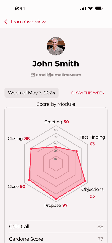
I was asked to design a feature that allows managers and high-level executives to see score and weekly usage data for the app, and to be able to export that into an email format. To support this request, I built a report tab that included a Team module progress overview, a module performance overview, a spider chart, a usage chart, history for the user or the manager to look back on transcripts and scores, and an email settings page. I additionally designed an email and the email copy to go out to users, as well as designed share sheet actions native to iOS.


Call Scoring
I was asked to design a new feature, "Call Scoring." The general principle is that a user could connect their third-party call transcripts to our trained models and compare against a provided call script. This would allow us to then generate a score and rate the user, giving actionable feedback per transcript so they could improve in actionable and meaningful ways, connecting the app more directly to their actual work performance.
I quickly built a prototype of this inside of Figma and used our AI models with some known transcripts from our actual user base to create mock-ups of generated data. I then interviewed the users and presented the app to them as if it were real-time generated reviews of their calls. I was able to get high-quality insights and feedback from them, as well as verify the value and their own potential acceptance of this process.


Continued Warning Signs
The team continued to have doubts as to the quality of the project, as it was undermined by poorly optimized code and changing priorities, with no roadmap to fall back on for understanding what was next.
Because leadership prioritized quantity of output over quality at this time, I had mounting concerns from users about core assumptions and mechanics inside the app that we could not address. My user testing and research demonstrated repeatedly that our most valuable features were items we were deprioritizing or could not actually deliver at scale.
Beyond the poor UX, I was also still deeply unsatisfied with the UI; it felt like rearranging garbage instead of actually making the app look/feel better because of the constraints we were working under. And with cross-team collaboration restricted, some current issues were compounded.

Launch to Users
Our launch to our users, being internal teams, was delayed and pushed back repeatedly across several weeks that turned into several months. This is because of promises that were made from leadership without checking feasibility or measuring resources it would take to create a satisfactory quality of product.
In addition, many of our team members, including myself, continued to raise concerns about the focus of the product and discrepancies between our user preferences and data and what the product focused on and could do. Despite this, leadership continued to have extreme confidence and chose to not answer these concerns.
It was disappointing then, but not surprising when we launched the app, sent out internal emails and scheduled walkthroughs with different users to help orient them to the app, and found that adoption was nearly 0% of onboarded users. Retention was a complete failure. When pressed into using the app, users ran into bugs and made complaints that the app did not match/help with actual use cases at work.
10X Trainer V2
Taking Strategic Lead
When our initial launch failed, most of my team became very discouraged, including the leadership that had been pushing the project forward. However, I took it as a learning opportunity and began comparing the feedback with my own assumptions and what we had already learned from users.
I started refining ideas and solutions I already had considered to the problems that I was tracking, and organized them by predicted impact. I then wrote a strategy document roadmapping a plan to rebuild the app around what we knew about our users and connecting our best and most valuable features inside of a new interface. This new UI would essentially be a holistic rebranding of 10X Trainer, and included gamification principles, a more natural flow, coaching abilities, and other design techniques to reduce churn, to increase user delight, and give us opportunities for motion and reward mechanics.
It was ambitious, but I had evidence to support this proposal, and consulted the product team to get buy-in from them and allow them to pass this idea off to other key stakeholders they had access to. There also was no clear leadership at this moment, creating an appropriate moment for me to drive team direction.

User Research
We had so much data already, I did not feel a strong need for specific user testing - I already knew it was a mess. However, I still wanted to check on perceived versatility of the app and what it was being used for. I scheduled a meeting with our single power user for the process of writing a roadmap, and picked their brain about why they used the app and what other apps they were using instead/were considering. I learned that what they wanted to use the app for wasn't available in the app, but that it was something we could easily add it. I also learned that the competitive features strongly drove usage for this user and others.
Ideation of New Mechanics
I started with user flows, so I could capture and outline key user touch points throughout the experience of using the app. I outlined flows for the user's first experience with the app (area of high friction and churn), progress throughout content (long-term retention), and an "arcade" experience (custom tools for power users, and a stream for long-term value building in the app).

Sketching a Rebrand
The previous UI had fundamental issues that made creating a lovely, delightful looking app experience challenging. The UI needed to be founded with scaling for new features in mind, and with a gamified experience at its core. It needed to be fresh. I committed my ideas to paper/FigJam and used many of my sketches as communication pieces in syncs with the product team. I also collected a few key mood pieces and started building a new brand identity for 10X Trainer that had personality and depth.

Design Library V2
Because of clear documentation, a strong vision, and an understanding of what was needed to make this app successful, I coordinated with our developer team in building a new, isolated design library specific to the new version of 10X Trainer to be built, including colors, typography, lists of component families, rules for publishing, templates, icons (with custom icons marked and ready for export to devs), and more.

Design
With communication expectations set between our teams, a system for design components to be created and indexed in, user flows prioritized and outlined, and much greater autonomy to execute on the findings of our team, I led the design team to rapidly create high-fidelity screens and documentation in Figma that comprehensively addressed key user complaints, showed learnings from the failed product launch, and connected stakeholder goals with tangible product features. I also used LottieFiles and Adobe Illustrator for animated visual assets.
It included new colors and theme/brand, a more accessible dark mode, a new onboarding experience, better introduction to app mechanics like streaks, in-app notifications, the introduction of app content as campaigns with dynamically growing cities, a visually pleasing presentation of individual content pieces with intuitive progression systems, overhauled scoring that focuses on positive reinforcement, improved profile incentives and abilities, enchanced leaderboard designs, and a brand new arcade/custom role-play building feature.


Database and Content Management
I set up comprehensive databases in Notion and worked with the developer and product teams to establish templates and formats for content to be created, so we could have materials built at scale. This level of coordination allowed us to very clearly and explicitly attach databases to functions and function calls in the app, and allowed our developer team to build their data structure with the opinion of the app already in mind. We also kept the floor open to adjust UI and UX elements to accommodate what our data structure could allow.
App Store Launch
I created App Store marketing materials for Apple's developer Connect platform, and coordinated with the product team to write some of the marketing copy. I helped to get our team set up to publish code to the App Store, and I also assisted the product team throughout the entire review and approval process. Our app is now live on the App Store, even though it has closed account creation that's handled manually by my internal team

Reflection
Overall
This project was intense and difficult to be a part of. There were serious doubts as to our ability to deliver anything at times, and if what we would deliver would constitute any value. While I am reluctant to assign blame, this project suffered in large part because of leadership failures. This gave me the opportunity to take on much greater leadership and ownership of this project, but cost time, resources, and user confidence.
I'm proud of what we were able to build in the end, because of how much overcoming this hurdle has meant.
Looking Back
I'm frequently in a position where I'm not able to get enough user data to validate or invalidate ideas. But for this project, I had an abundance of data, just no one who prioritized my insights. This cost the team, and we ultimately did end up following many of my suggestions and insights in the end for our most successful launch. It just took us longer to get there. It's a good reminder to always pay attention to what users are saying and to remember that as the designer, my bias is inherently different from the experience that users will have.
Looking Ahead
I'm grateful for the way this project pushed me and gave me opportunity to take ownership of product and to see that I already excel and practice many product skills as a UX designer. I plan to take a lot more ownership for product strategy and cross-team collaboration for all my future projects. Frankly, I never want to be on a project characterized by obvious lack of leadership and over-criticism of team member ability and value, and it's my commitment to be a better leader than what I experienced here.