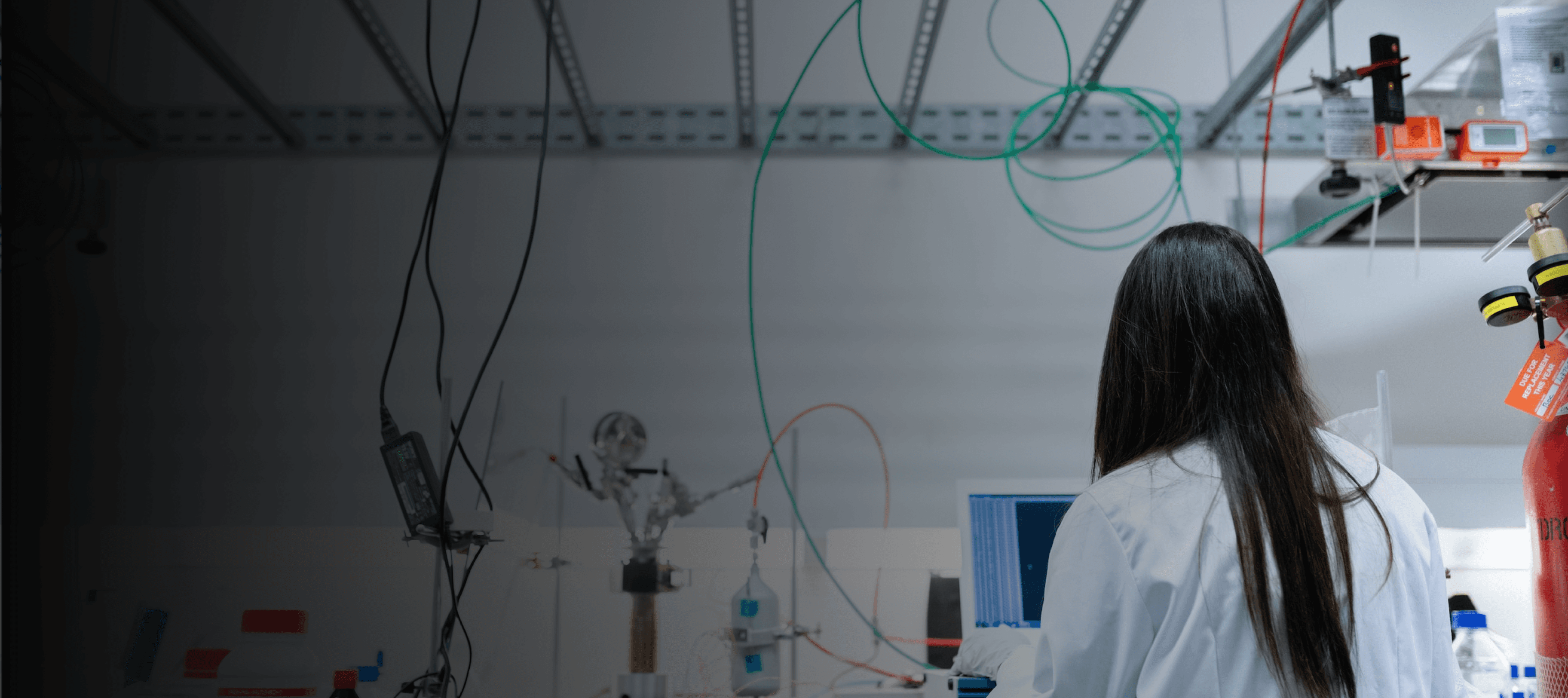
Applus+ Laboratories
B2B desktop website hosting services for industry experts across Aerospace, Automotive, Cyber, Electronics, Renewable Energies, Construction, Railway, Medical and Pharma

Project Overview
I led a team in redesigning Applus+ Laboratories' desktop website. Applus+ Laboratories is a renowned company providing services to various industries, such as Aerospace, Cyber, Construction, and Pharma. Our project aimed to leverage existing hi-fi screens provided to develop a user-centered and visually appealing website for Applus+ Laboratories. It needed to accurately represent their brand and be connected with their parent site, showcase their services, and facilitate efficient communication with their target audience.
Problem
Applus+ Laboratories, a division of Applus+, lacked a dedicated webpage to showcase their services and expertise. The absence of a tailored online presence hindered their ability to effectively communicate with clients and showcase their capabilities. The parent site also lacks clear navigation, inhibits efficient data access and analysis, and does not create a cohesive and engaging user experience.
Solution
My team redesigned eleven total screens for Applus+ Laboratories to make their upcoming website usable, appealing, and an effective platform to reach their audience. We started by creating a functional prototype, conducted thorough usability testing, and generated a comprehensive usability report with actionable recommendations. Collaboratively, we translated user feedback into refined designs that aligned with the client's objectives and presented better IA, used consistent design patterns, met web accessibility requirements, and overall demonstrated better UX.
Process
Role and Team
Team lead (UX/UI)
5 UX designers
1 PM
1 Design mentor
1 QA mentor
Tools
Timeline
6 weeks


User Research
Kick Off
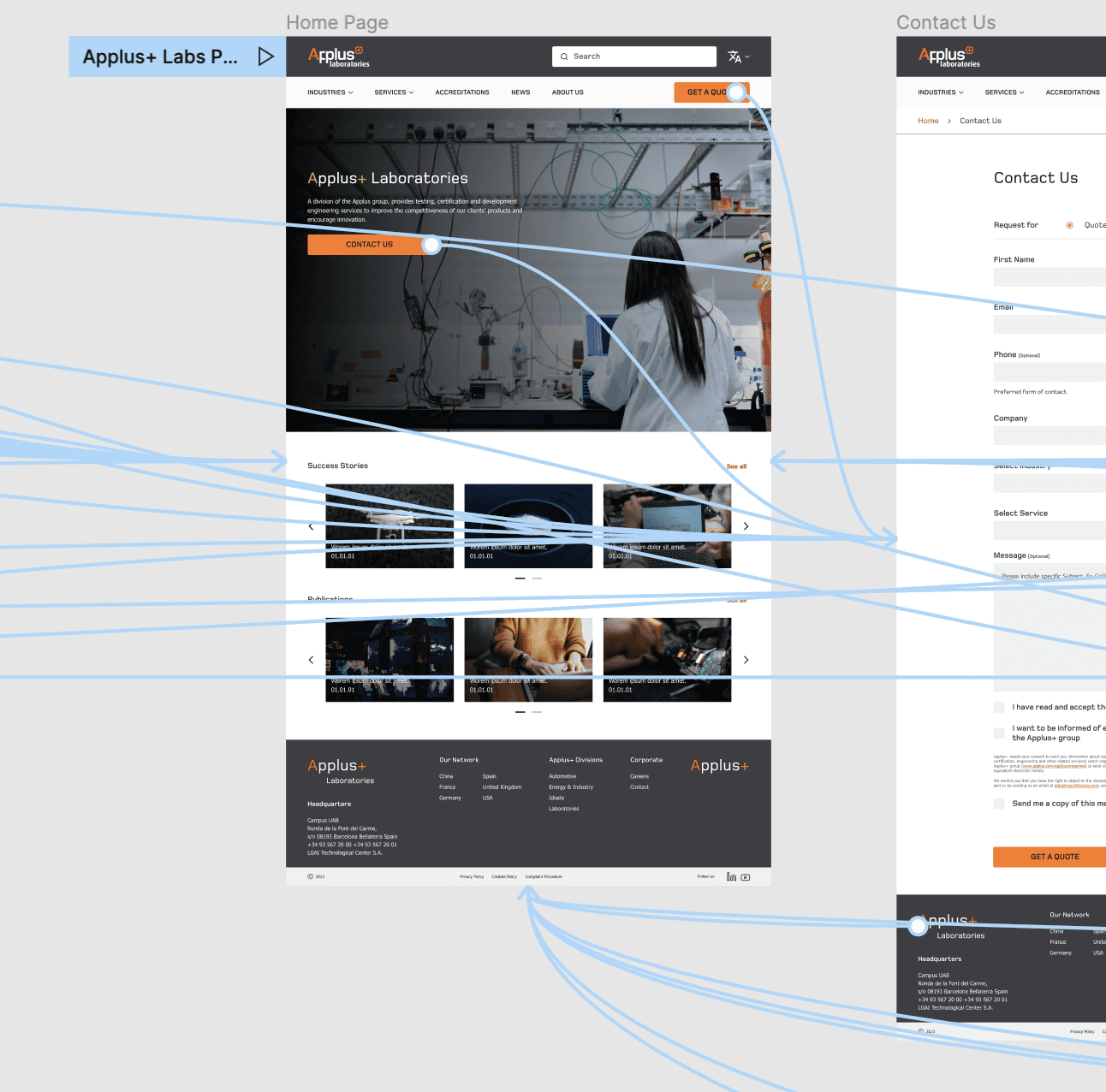
Applus+ Laboratories provided my team with a set of user flows, some key hi-fi screens, a style guide with colors and typography from their parent organization, and a developer hand-off package from the team that designed the screens. They asked us to do usability testing, implement feedback, and then prepare a new design to hand-off. I led my team in a kick-off meeting where we orientated ourselves to these materials, including talking about the user journey, phases of the project, a timeline to work against, and preparing for agile workflow. We also identified some areas of potential friction for users that we could watch for throughout the design process.
Prototyping
Using the screens provided by the client, I led the team on using existing design assets to develop a high-fidelity prototype that accurately represented the interaction design for Applus+ Laboratories' website. Throughout this process, I focused on creating uniform master components and refining the design details to ensure a cohesive and immersive experience during user testing and client presentations. This high-fidelity prototype served as a visual and interactive tool to showcase the intended user journey and gather feedback from users and stakeholders.
Usability Testing
I took a lead in developing a user testing plan and script for the usability testing. I carefully planned the testing process, considering the target demographic of engineers, technicians, and business developers. Using UserTesting.com, we recruited six participants and conducted remote unmoderated usability testing. The participants were given specific tasks to complete using our high-fidelity prototype, and we recorded their interactions for detailed analysis. Our testing plan specifically focused on evaluating the effectiveness of the navigation menu, the ease of requesting a quote, and users' ability to access information about Applus+ Laboratories' services and industries.

Findings and Problems
Reluctance to use the primary CTA "GET A QUOTE” due to its intimidating and final impression.
High interaction cost associated with the CTA, impacting user engagement.
Difficulty in reading the body copy, resulting in low content discoverability.
Challenges in locating relevant information, requiring significant effort.
Gaps in information architecture, leading to navigational confusion and backtracking.
User preference for Services submenus over the Industries menu, further contributing to navigation issues.
Solutions
Change the CTA copy to be more friendly and open
Ensure the button's purpose is clear and inviting
Improve readability by using consistent body styling and layouts
Adjust the weight, typeface, or size to increase legibility
Incorporate more visual elements to support comprehension and scanning
Emphasize the Services menu and simplify navigation
Refine navigational heading copy and menu components for improved clarity
Improve information accessibility, and streamline navigation on the website.
Redesign
"Contact Us" Overhaul
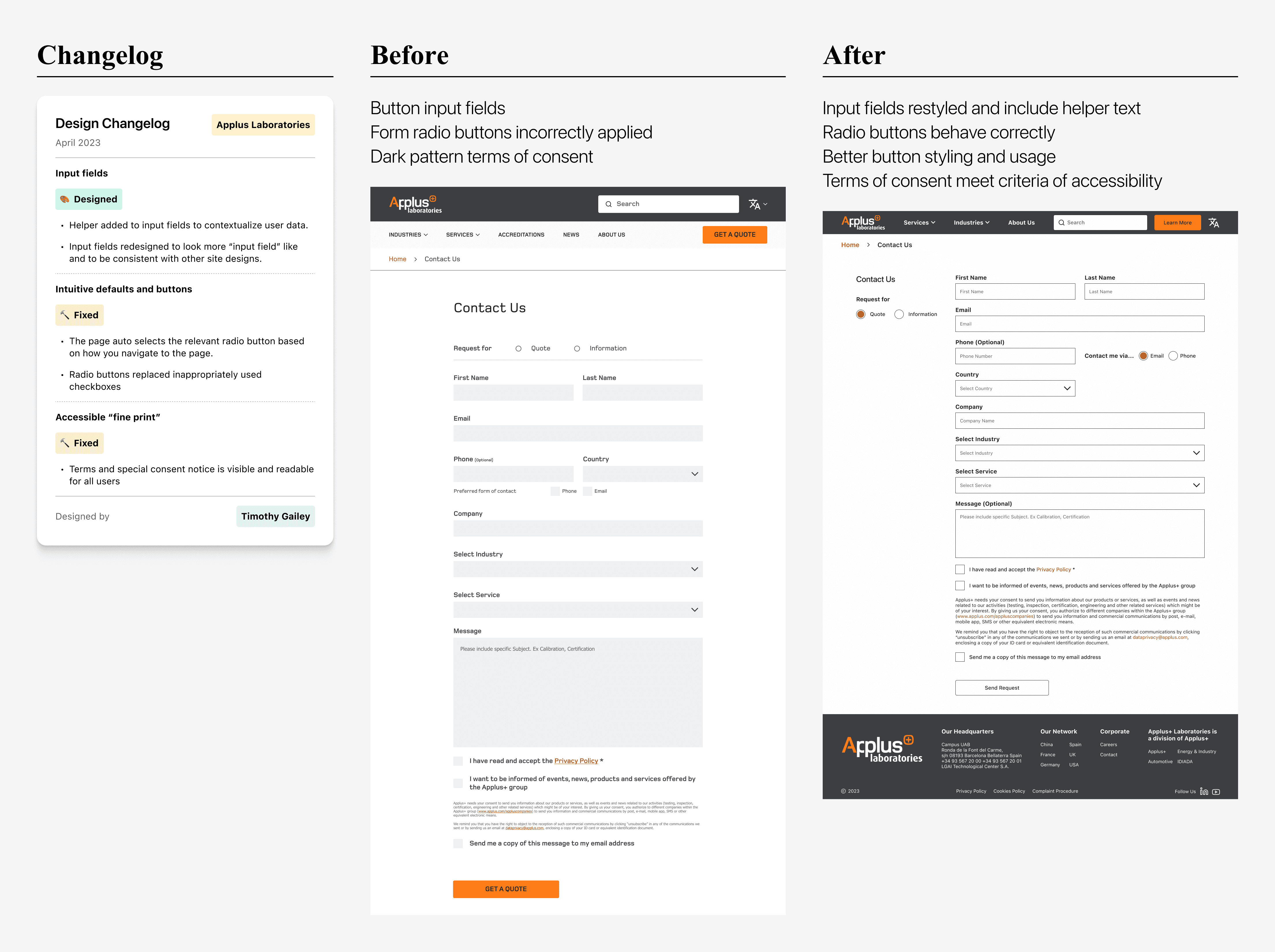
I personally redesigned the Contact Us page to address layers of inaccessibility: incorrect form buttons being used, input fields that looked like buttons, and impossibly small terms of agreement text being the biggest offenders. I added helper text to help contextualize user input; the “input buttons” were completely done away with and replaced with true input fields; and the fine print at the bottom of the form was made more accessible. Changes like these help preserve user trust, which is essential for brand strength and user conversion on submission forms.
CTA and Button Changes
I replaced the intense orange with a softer shade that not only passed AA accessibility standards, but also created a more pleasant and inviting visual experience. I then revised the button copy from the all-caps “GET A QUOTE” to a more user-friendly and approachable “Learn More.” Additionally, I adapted the design for hero images by introducing alternative secondary button styles, including an all-white button that stood out against a black background and a variant with a black border. These adjustments ensured that users had clear options for interaction and maintained a harmonious visual aesthetic throughout the website.

Layout Changes
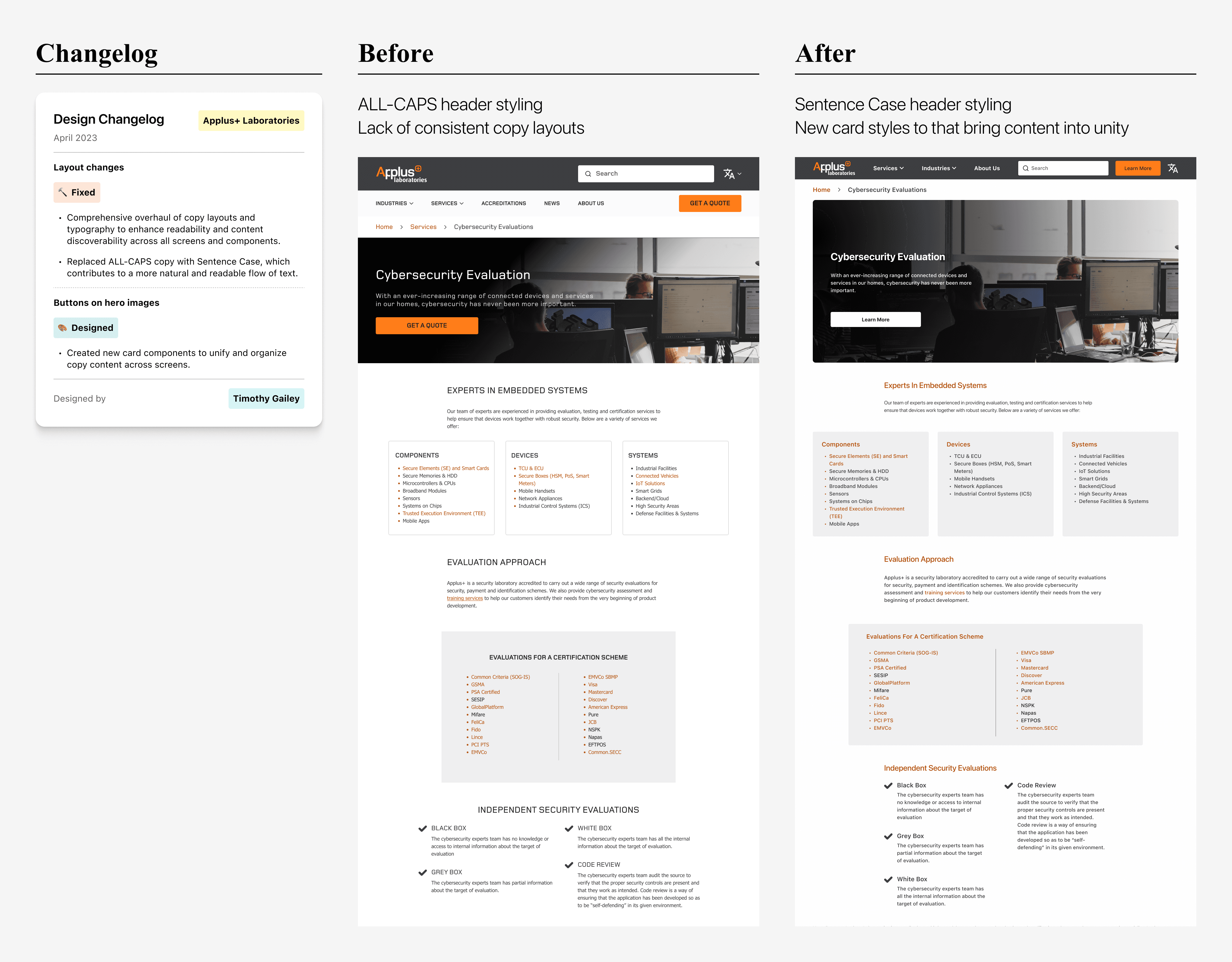
I did a comprehensive overhaul of copy layouts and typography to enhance readability and content discoverability across all screens and components, including cards and other UI element, and created new components where necessary. Our focus on standardizing visual and typographic components brought consistency into the design. We made a significant change by replacing all-caps copy with Sentence Case, which contributed to a more natural and readable flow of text. These collective refinements aimed to provide users with a more coherent and scannable reading experience while navigating the website.
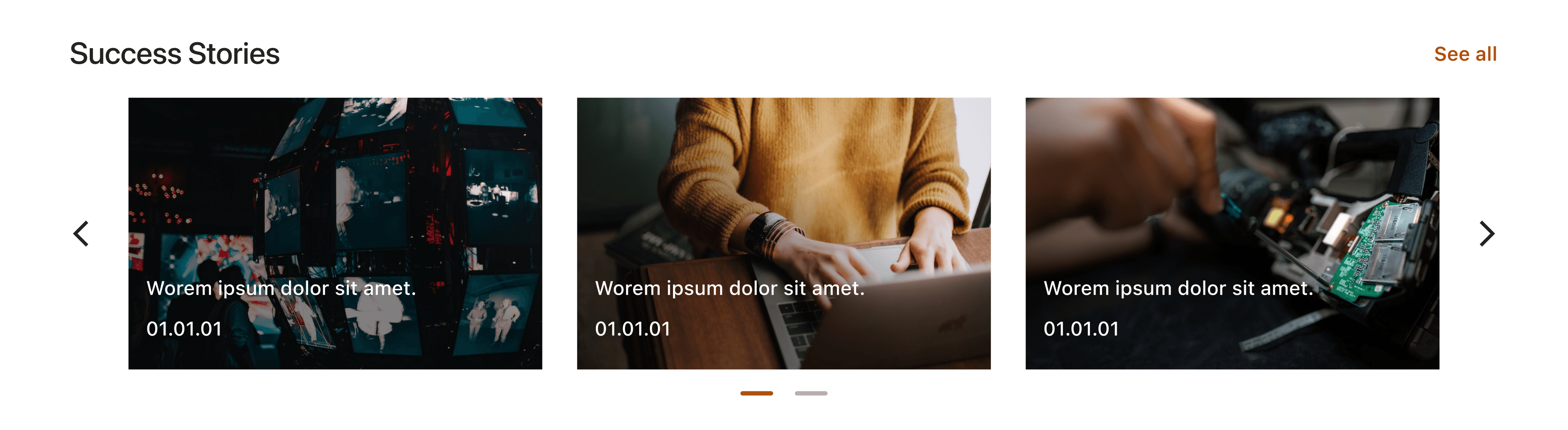
Hero Image Changes
To enhance the visual appeal and user experience on landing pages, I introduced generous white space around hero images, creating a sense of breathing room and a more balanced composition. Additionally, I applied a subtle curve to the corners of the images, adding a touch of friendliness and warmth. By resizing the hero images across screens, we ensured they were optimized to encourage user scrolling and provided a consistent and clean aesthetic throughout the website. These enhancements aimed to create a visually pleasing and welcoming atmosphere, capturing users' attention and engaging them from the moment they land on the page.

Typographic Changes
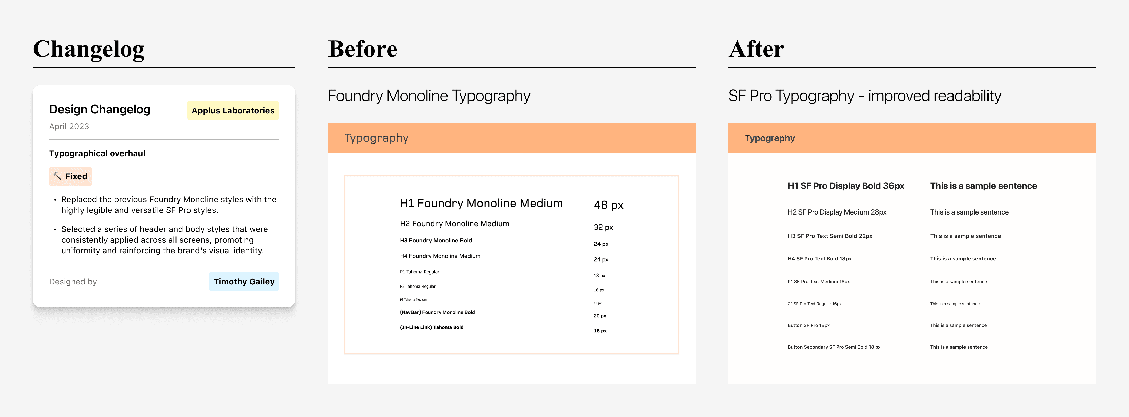
One of my key interventions was the revision of typographic styles throughout the entire project. We made a strategic decision to replace the previous Foundry Monoline styles with the highly legible and versatile SF Pro styles. By making this transition, I achieved a significant improvement in the overall reading experience, particularly in text-dense areas. The SF Pro font provided excellent clarity and ensured that users could easily consume the content without unnecessary strain. We carefully selected a series of header and body styles that were consistently applied across all screens, promoting uniformity and reinforcing the brand's visual identity.
Menu Bar Changes
I made significant improvements to the menu bar, focusing on improving navigation and usability. I simplified and resized the header to a standard height, reducing visual clutter without compromising functionality; I also streamlined the menu items and cleaned up the drop-down menus to enhance user intuition and ease of use. These enhancements resulted in a smoother navigation flow and improved access to desired sections of the website. The redesigned menu not only optimized usability, but also provided a more efficient browsing experience.
Other Navigational Improvements
To improve the user navigational experience beyond the primary menu bar, I redesigned the breadcrumbs, ensuring they provide clear and precise indications of the user's location within the website. I then simplified and enhanced the footers, making them more user-friendly and accessible. These adjustments aimed to provide users with a smoother and more intuitive browsing experience, minimizing visual distractions and optimizing usability.
Developer Hand-Off
Annotations and Measurements
To ensure an effective developer handoff, we redlined all screens with measurements and provided comprehensive annotations. This process ensured that developers had clear guidelines and references for implementing the designs accurately. As team lead, I reviewed all annotations for accuracy ad consistency. With this documentation, I included color palettes, arrows that guide developers through interactions, typography, and component libraries, facilitating a smooth transition from design to development.

Reflection
Overall
During this project, I encountered significant challenges, particularly in designing around a brand identity that clashed with AA standards. The need to advocate for changes and demonstrate their importance to the client pushed me to refine my communication and persuasion skills. As the project lead, I embraced the opportunity to lead the team, provide valuable insights, and represent our collective expertise to the client. Managing the project and coordinating with the project manager sharpened my organizational and coordination abilities.
Looking Back
One of the most satisfying aspects was witnessing the validation of my design experience, as usability issues I predicted surfaced during user testing. This reaffirmed the importance of user-centered design and reinforced my commitment to advocating for the best design solutions to the client, while still prioritizing their interests and maintaining project momentum.
Looking Ahead
This project highlighted the significance of effective communication and persuasion skills when collaborating with clients and stakeholders. The technical limitations encountered throughout the project challenged me to think creatively, problem-solve, and seek innovative solutions. As I move forward, I will be even more mindful of how the client's interest fit into any design project as a type of user, and how that can require out-of-the-box and highly adaptable solutions to accessibility problems.