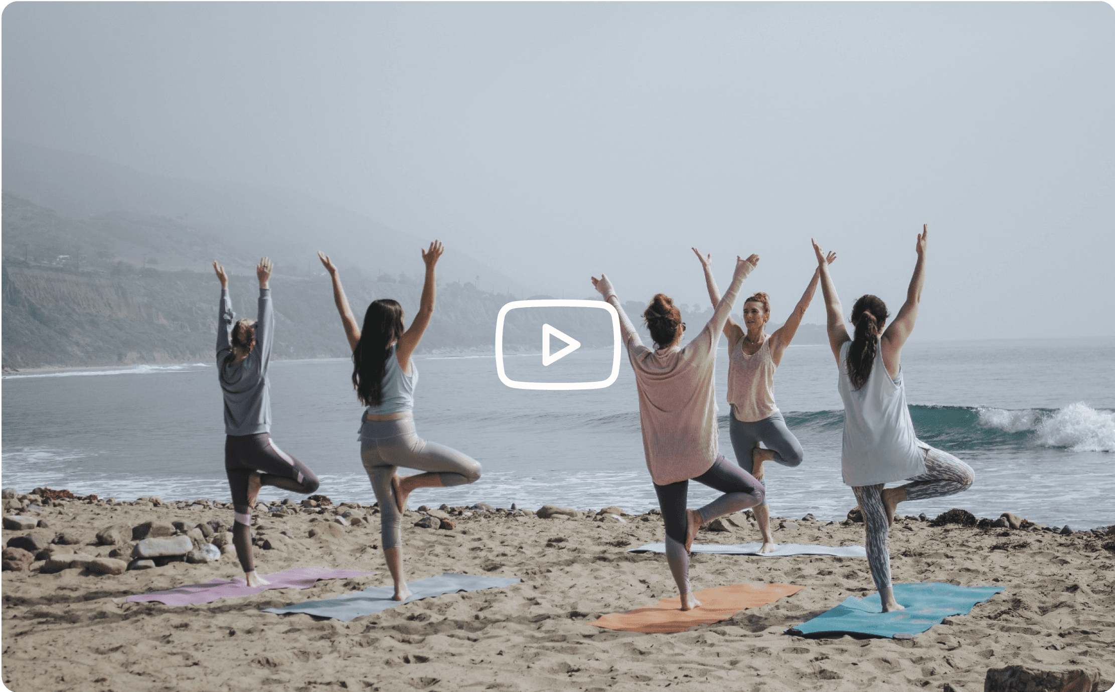
CoachPals
B2B social media website for health and wellness experts to connect and network, promote products, and build up brand identity.

Project Overview
I redesigned the CoachPals website and created new features for use in expanding their platform. CoachPals (formerly MyAsanaDiary) is a website that allows wellness experts to blog, create communities, and create versatile profiles, similar to social media platforms. The project focused on redesigning key parts of the onboarding flow and style guide, and the creation of several new profile types that would allow CoachPals to expand its business audience. I worked on the UX/UI aspects of the design process which encompassed creating wireframes, updating the CoachPals style guide, designing high-fidelity screens for prototyping, and making comprehensive documents for developer integration.
Problem
CoachPals faced a pivotal challenge in their journey to broaden the versatility of their platform and cater to a more extensive user base. The existing design structure was confined to accommodating only two types of profiles: the 'Community' (basic) and the 'Professional' (paid) profiles. However, as CoachPals' business roadmap evolved, they recognized the pressing need to extend their offerings beyond this limited scope. The vision was clear – to introduce two new profile types into their product, aligning with their strategic goal of diversifying their user audience and enriching the platform's functionality.
Solution
My team designed ten total new screens, developed innovative cards and components, and redesigned the pricing table screen in the onboarding process for CoachPals. Our process began with competitive analysis, user flow definition, and wireframing. Collaboratively, we iterated through high-fidelity UI designs that met web accessibility standards and embodied a human-centered approach. The results were fully-realized high-fidelity screens with consistent design, enabling CoachPals to cater to a broader audience and enhance the user experience.
Process
Role and Team
UX/UI Designer
4 UX designers
1 PM
1 Design mentor
1 QA mentor
Tools
Timeline
6 weeks


Ideation
Kick Off
CoachPals provided me with a style guide and several components that were in use across their site. They asked us to create screens for a new product profile and a new team profile, both of which would soon be featured on their platform. My team and I met to break down the materials and orient ourselves. We organized an outline for the project, a timeline, and phases of the design process we would work through. My team followed an agile workflow for this project.
Competitive Analysis
My team took the time to do lightweight competitive analysis. This helped us get a feel for the industry, identify appropriate design patterns, and start generating relevant and useful ideas. We also were able to start cementing our team culture and dynamic. This crucial initial step set the foundation for informed design decisions that not only elevated user experience but also help position CoachPals as a front-runner in the industry.
User Flows
Considering the new flows CoachPals wanted, we spent some time discussing what user flows would be useful in the design of the client's new features. We recognized the paramount importance of designing user flows that would seamlessly integrate these novel features into the platform. To achieve this, we conducted collaborative brainstorming sessions that fostered a holistic understanding of user needs, pain points, and goals. These discussions were instrumental in identifying key user journeys that would be both intuitive and impactful.

As a user, I want to create an account and log in.

As a user, I want to be able to view the homepage and identify the different types of entities/profiles available.

As a user, I want to view a team profile.

As a user, I want to view a product profile.
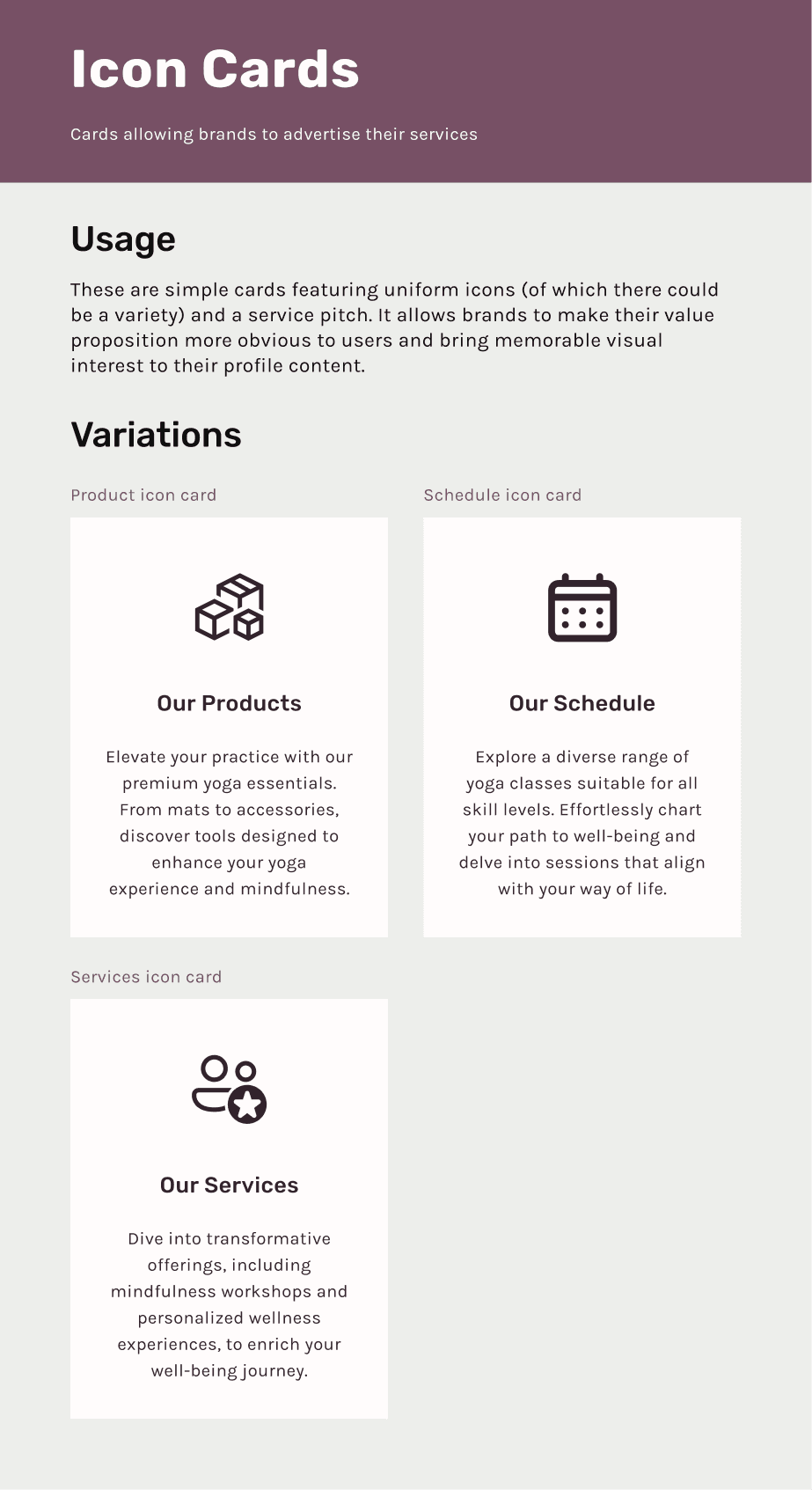
Wireframes
Our wireframing process unfolded in two distinct phases: low-fidelity and medium-fidelity. In the initial low-fi stage, we sketched out rough yet foundational concepts that served as the visual blueprints for our discussions. These rough sketches allowed us to collectively envision and iterate on our ideas as a team. To streamline our wireframing process, I curated a component deck, enabling us to rapidly construct a multitude of wireframes. This iterative approach proved invaluable as we gradually refined our concepts, ultimately identifying a select few that stood out as winners.
My role extended to ensuring consistency across the wireframes. I meticulously referenced the client's materials and strategically incorporated elements that reinforced the branding consistently from one screen to another. Additionally, I conducted in-depth research to identify best practices for various design patterns we were leveraging, such as 'pricing tables' and 'review or testimonials.'

Product Profile w/ Mixed Reviews

Product Profile w/ Gallery and Reviews

Product Page

Profile Alert

Pricing Table - Expanded

Leave a review

Pricing Table - Default

See All Product Reps
Design
UI Iterations
Building on the foundation of our wireframes and extensive eliminations, we transitioned into the realm of UI iterations, with a particular focus on the 'Team Profile' screen. This screen posed an intriguing challenge—it needed to maintain stylistic continuity with the existing 'Professional Profile' screen while infusing it with a unique and attention-grabbing flair, as per CoachPals' directive. We designed four iterations that shared a common core DNA, but strategically played with an array of colors and headers. This iterative design approach allowed us to explore various visual avenues while ensuring that each version aligned with CoachPals' brand identity and vision.


Hi-Fi Screens
Within the high-fidelity design phase, my focus was primarily directed towards the onboarding section, where I meticulously crafted screens that introduced users to CoachPals' enriched features. My role extended beyond visual aesthetics; I delved into interaction design, ensuring that the onboarding process was not only visually engaging but also functionally seamless.
To maintain design consistency and expedite our workflow, I took the initiative to create a comprehensive high-fidelity component library or deck. This resource became instrumental in streamlining our design process, facilitating rapid iteration, and guaranteeing that our screens adhered to CoachPals' visual guidelines.
Moreover, I paid meticulous attention to the finer design details, such as shadows, color contrast, and typographical blending. These subtle yet critical elements contributed to the overall accessibility and usability of the platform, ensuring that CoachPals' digital ecosystem not only looked exceptional but also delivered a superior user experience.
Style Guide
As the project evolved and our high-fidelity screens took shape, it became evident that our design journey extended beyond the screens themselves. To ensure design consistency and alignment with CoachPals' evolving vision, we took proactive steps to enhance the provided style guide. This included an update to the featured components, incorporating the latest design elements and refinements we had crafted during the project.
One notable aspect of the style guide update was the standardization of button styling. I recognized the pivotal role that buttons play in user interactions, and pitched a uniform design to the team to ensure a seamless and intuitive experience across the platform.


Developer Hand-Off
Annotations and Measurements
As part of a developer handoff, we annotated and provided precise measurements for all screens. I created a custom annotation card for my team to use that allowed them to provide consistent looking, brand appropriate notes for screens. Annotations included detailed explanations and references, ensuring that developers had clear and comprehensive guidelines for translating our designs into functional features.

Component Documentation
As part of a developer handoff, we annotated and provided precise measurements for all screens. I created a custom annotation card for my team to use that allowed them to provide consistent looking, brand appropriate notes for screens. Annotations included detailed explanations and references, ensuring that developers had clear and comprehensive guidelines for translating our designs into functional features.


Reflection
"Tell me about this project"
From the outset, the challenge of expanding the platform's versatility to accommodate new profiles intrigued me. I love being able to take something “good enough” and make it “more than great.” Our team's collective efforts to redesign key elements of the onboarding flow, introduce new profiles, and enhance the overall user experience were immensely rewarding.
One of the most fulfilling aspects of this project was the deep collaboration within the team. We brainstormed, debated, and iterated, pushing the boundaries of our creativity and design thinking. Our discussions, along with extensive user flow planning, formed the bedrock of our success. Creating high-fidelity screens was particularly satisfying, as we seamlessly integrated thoughtful feature placements and maintained visual coherence with the existing platform.
My attention to detail, from shadows and color contrast to typographical finesse, reinforced the platform's accessibility and visual appeal. Additionally, the creation of a high-fidelity component library and extensive documentation ensured design consistency and streamlined the development process. The component documentation I created immortalized our design thinking, laying the groundwork for a versatile and enduring design system. As we delivered the final product, I felt a sense of pride in our collective achievements and an eagerness to witness CoachPals' continued growth and success.