Developmate
B2B desktop web app for real estate developers, providing a comprehensive dashboard with powerful tools to search, analyze, and access real estate and contact data for efficient parcel development

Project Overview
I led a team of four other UX designers in a redesign project for Developmate, a desktop web application for real estate developers. Our goal was to enhance the user experience and optimize the platform's functionalities, focusing on search capabilities, data visualization, and parcel analysis tools. I played a key role in collaborating with stakeholders, creating interactive prototypes, conducting usability testing, generating a detailed usability report, implementing design changes, and preparing comprehensive deliverables for the developer handoff.
Problem
The existing design of Developmate, a desktop web application for real estate developers, posed several usability challenges. The interface lacked modernity and intuitive navigation, resulting in decreased user productivity and satisfaction. The complexity of searching, analyzing, and accessing real estate and contact data hindered the overall user experience. Furthermore, the outdated design failed to meet the expectations of users in terms of visual appeal and functionality.
Solution
To address these challenges, I revamped the design of Developmate's legend UI, onboarding screens, and map pin and card experience. By embracing modern design principles and intuitive navigation patterns, I improved and streamlined the process of searching, analyzing, and accessing real estate and contact data. I created an interactive prototype to gather feedback and refine the user experience iteratively. I led usability testing sessions to inform the prioritization of key features and the optimization of workflows.
Process
Role and Team
Team lead (UX/UI)
5 UX designers
1 PM
1 Design mentor
1 QA mentor
Tools
Timeline
5 weeks


User Research
Kick Off
At the start of our collaboration with Developmate, we received user flows, hi-fi screens, and a comprehensive style guide. Developmate asked us to conduct usability testing, incorporate feedback, and ultimately deliver an updated design solution. To ensure a successful project kickoff, I took the lead in organizing a team meeting where we immersed ourselves in the provided materials. During this session, we delved into discussions surrounding the user journey, mapped out the various phases of the project, and established a clear timeline to keep us on track. We reviewed all communications to ensure clarity and understanding of the client's expectations for our deliverables.
Prototying
I took the lead in utilizing the materials provided by Developmate to develop a functional prototype that showcased the interaction and functionality of the user interface. By creating master components, I streamlined the design process, ensuring a consistent and cohesive experience throughout the prototype. Our goal was to create an immersive and comprehensive prototype that effectively conveyed the envisioned user experience, and the prototype was that – convincing and engaging, enabling stakeholders and users to envision the application's full potential.

Usability Testing
As part of the usability testing process for Developmate, my role involved planning and implementing the testing sessions using a functional prototype. I collaborated with the team to define research questions and hypotheses that guided the testing approach. I also designed and prepared the tasks for the participants, specifically targeting four main user flows related to account sign-up, login, dashboard view, and interaction with the legend. We recruited 5 users through UserTesting.com for unmoderated virtual testing sessions.
We documented the findings and insights in a comprehensive usability report. This report synthesized the research data, highlighting key observations, user feedback, and recommendations for enhancing the application's usability, particularly in areas such as the sign-in process, interaction with the legend, and search functionality.

Findings and Problems
Users faced difficulty in locating the legend on the dashboard page, impacting their ability to navigate the platform and utilize its main features effectively.
Differentiating between the Create Account and Log In screens presented a challenge for users, resulting in confusion and incorrect actions.
The presence of UI jargon in the prototype caused misunderstandings and unexpected behavior among users.
Solutions
Make the legend on the dashboard page more discoverable by adding an expanding interaction when a location is entered.Ensure the button's purpose is clear and inviting
Incorporate a dropdown menu for the legend options among the filters on the search bar as an alternative way for users to access the information.
Differentiate between the Create Account and Log In screens by designing a new landing screen with distinct buttons for each action, facilitating user decision-making.
Improve the language used in the prototype by researching and using terms that align with users' expectations, enhancing clarity and reducing confusion.
Redesign
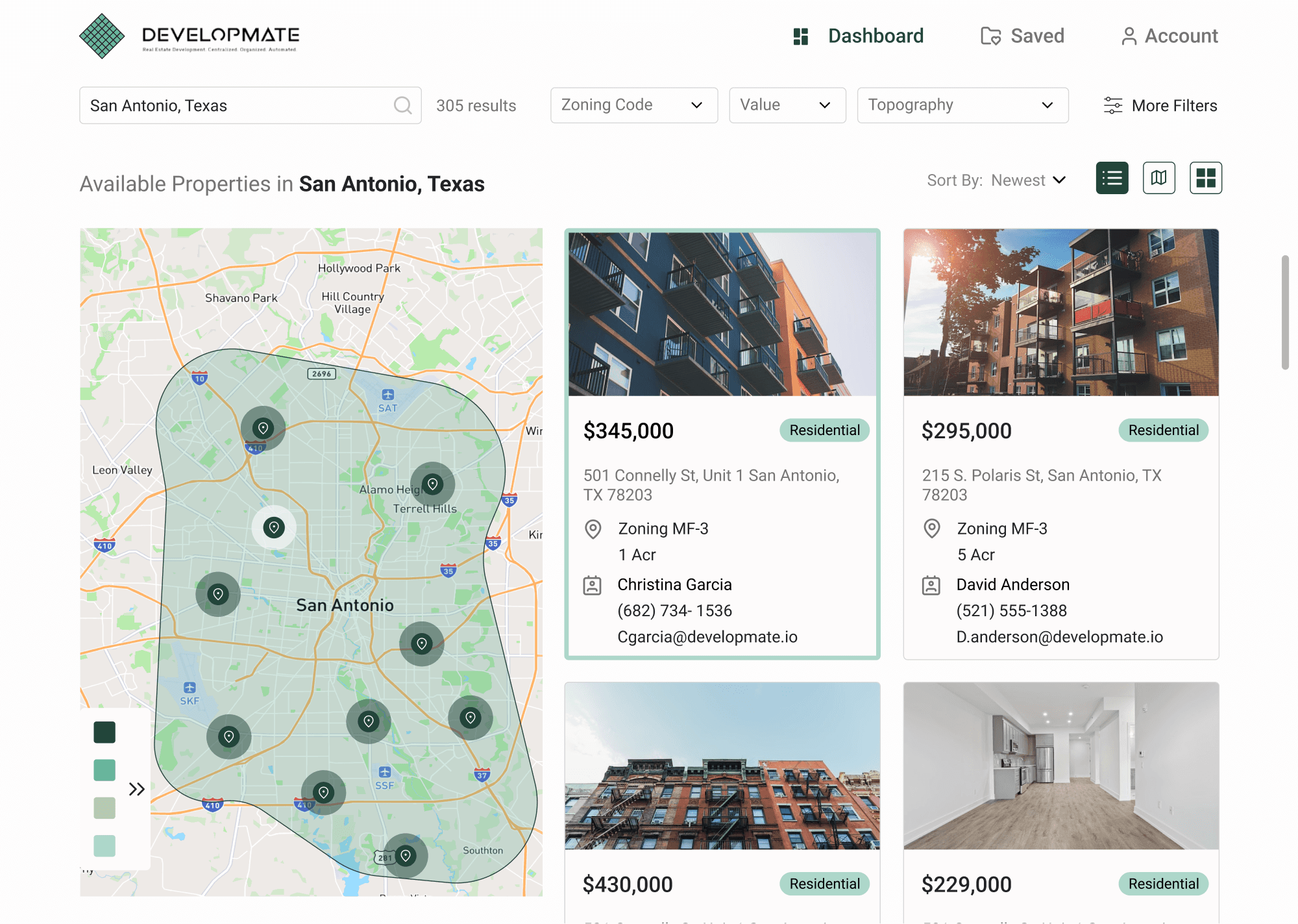
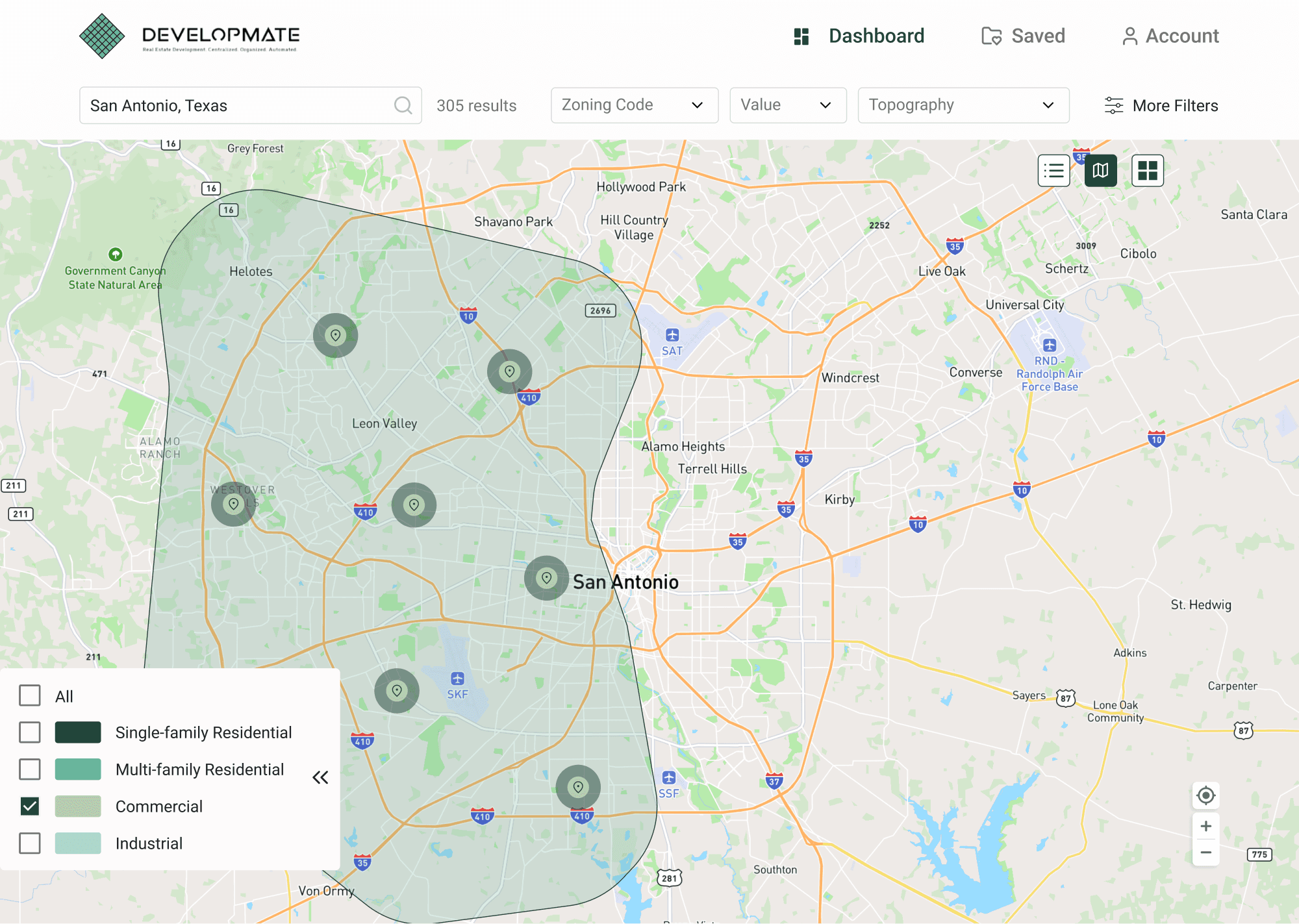
Legend Changes
When I proposed the redesign of the legend to the client, I discovered that they had plans to add a significant amount of content to the legend. Recognizing this, I adjusted our approach and recommended changes to make the floating legend capable of accommodating larger content groups. We introduced icons to represent each group, implemented progressive disclosure to guide users through the legend, and refined the design of the map pins to enhance their association with each specific group. These modifications resulted in a more organized and visually cohesive legend that effectively communicated the different content groups to users

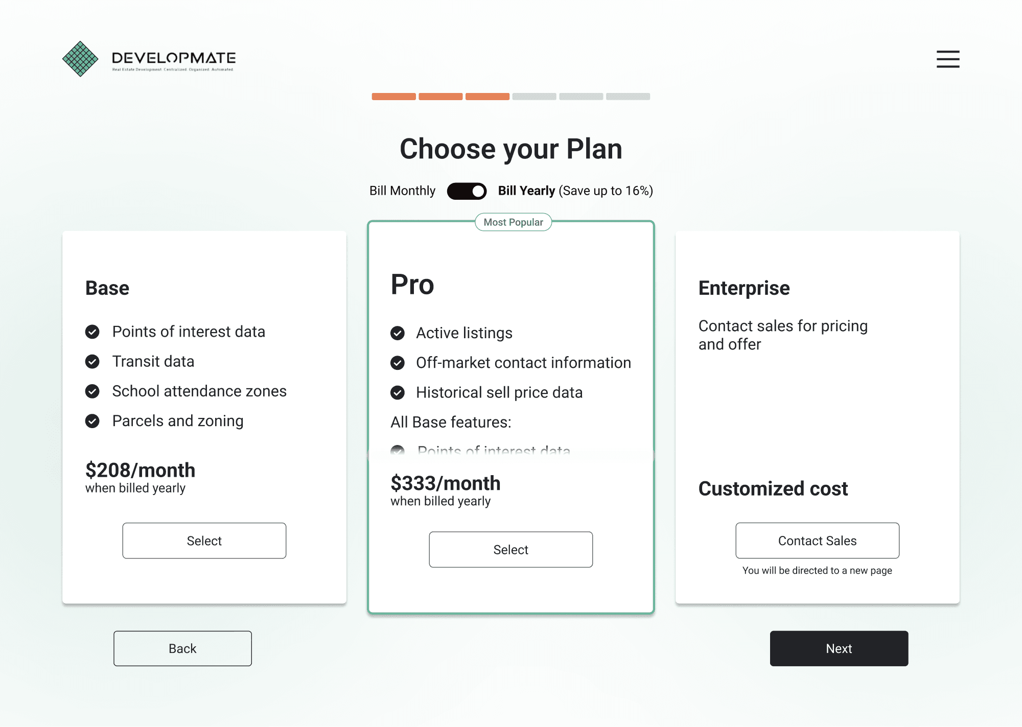
Card Changes
I took the opportunity to enhance the visual presentation and improve user understanding of the "Pro" card. I created a scroll effect within the "Pro" card, allowing users to easily view and access the additional features included in the upgrade. This scroll effect effectively conveyed the value proposition of the "Pro" package, emphasizing its enhanced offerings compared to the base version. The redesigned card design provided users with a clear and visually engaging representation of the upgrade, encouraging them to consider the benefits of the "Pro" package.

Interaction Changes
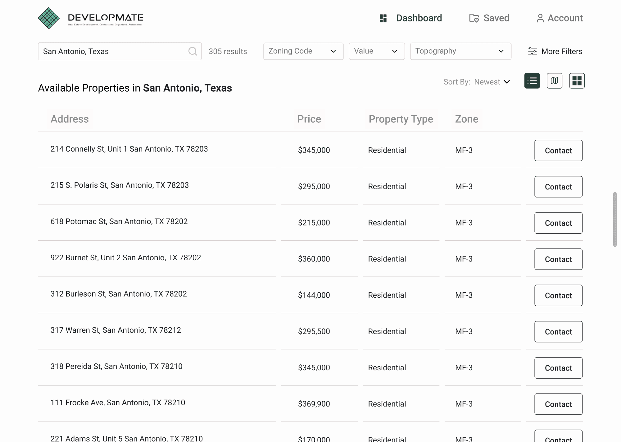
To enhance the user experience and improve interaction with map pins, we made significant improvements to their hover state and overall interactions. For pin interactions, a hover state interaction was added that shows a mini card, which then is replaced by a larger side card. These changes were extended to the grid page, along with a card outline that matches the pin selection, ensuring a seamless experience across different sections of the application.

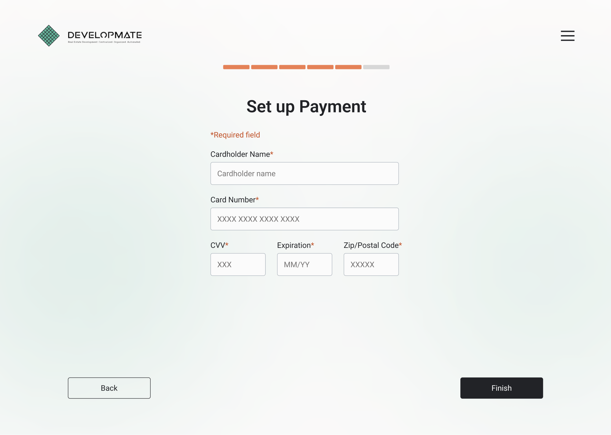
Onboarding Changes
To reduce user confusion during onboarding, we updated the copy from "Sign Up" to "Create Account" and "Sign In" to "Log In," ensuring clearer and more intuitive language for users. Additionally, we added colored indicators for required fields to make it easier for users to identify and complete necessary information. CTA buttons were enhanced by increasing their size and ensuring accurate copy, improving usability and guiding users through the onboarding flow more effectively. Furthermore, we improved the link/secondary CTA buttons by adding color and increasing their size, creating visual distinction and encouraging user engagement. Across all onboarding screens, I worked on applying consistent typographic styling and spacing, promoting uniformity and enhancing the overall visual appeal of the user interface.

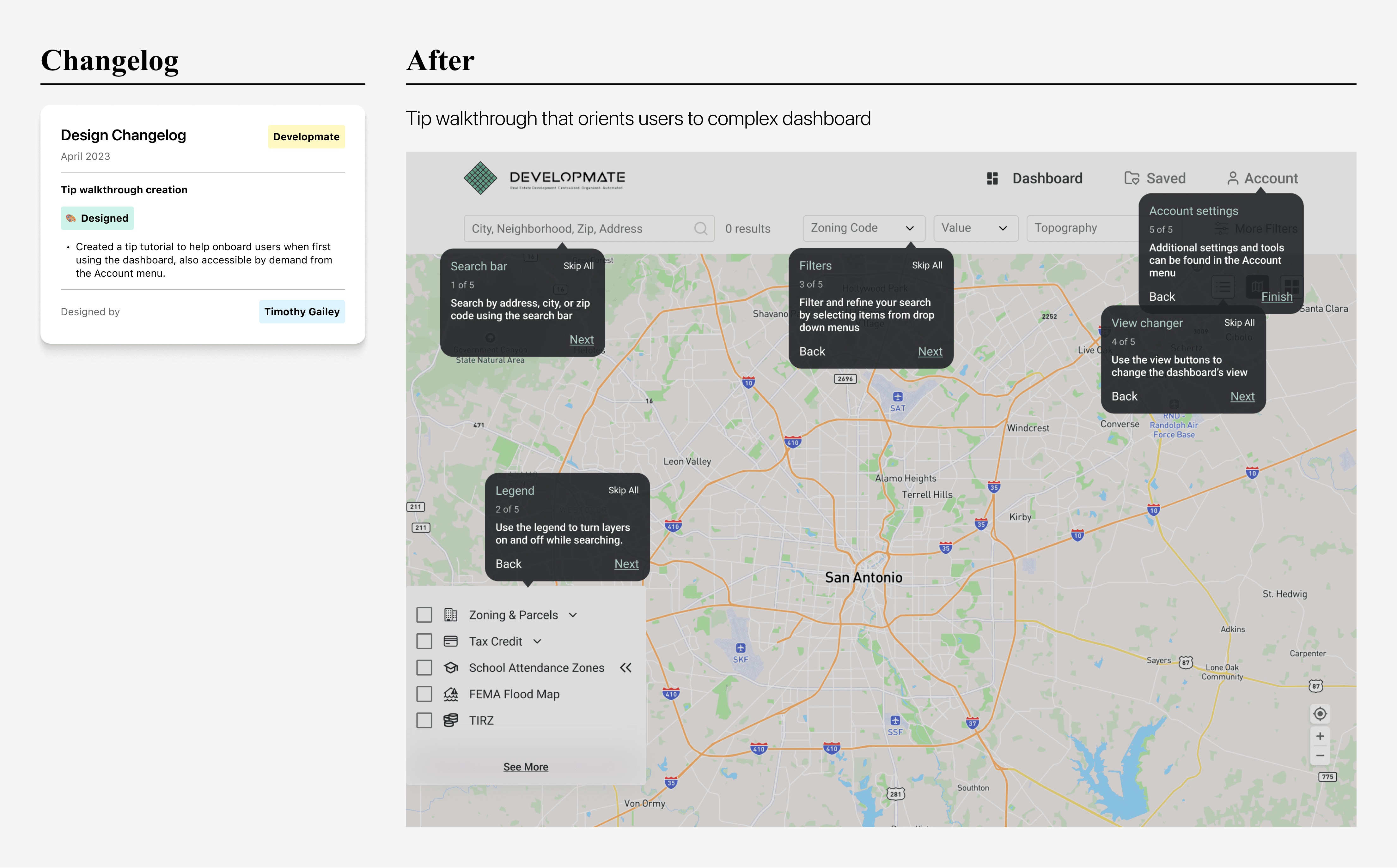
Tip Walkthrough
To enhance user exploration and comprehension of the main dashboard page, I worked on implementing a tip walkthrough feature. This feature provides users with a guided tour that highlights and explains the key features and functionalities of the dashboard. By presenting these tips step-by-step, users are able to easily discover and understand the various components and their purposes. The tip walkthrough ensures that users are equipped with the knowledge needed to navigate and utilize the dashboard fully.
Developer Hand-Off
Annotations and Measurements
To facilitate a smooth developer hand-off process, we meticulously redlined and annotated each screen, providing detailed guidance on design specifications and functionality. In addition, we incorporated arrows to visually guide developers through various user interactions, ensuring a clear understanding of the intended user experience. As a lead on the project, I personally reviewed and verified the accuracy of all the developer hand-off documentation, ensuring that the implementation aligns with the design vision.

Reflection
Overall
Overall, the project was a great experience characterized by excellent team chemistry and cohesion. Despite the challenge of working with unfamiliar industry terms, I successfully navigated this hurdle by maintaining open communication with the client and seeking clarification whenever confusion arose within the team. As a leader, I played a crucial role in directing the team and organizing focused team meetings, which significantly contributed to the smooth progress of the project. I also prioritized regular communication with the client, ensuring they were well-informed about our progress throughout the entire project.
Looking Back
I learned about working with unfamiliar industries and the importance of effective communication and leadership. It reinforced the significance of adaptability and quick decision-making when faced with unexpected changes. One of the most prominent moments in the project was the unexpected need to redesign the legend feature. This change arose during the final stages of the project, but our team quickly adapted to the situation, recognizing the importance of giving the feature the attention and functionality it deserved. Our pivot showcased our flexibility and commitment to delivering a high-quality product.
Looking Ahead
Moving forward, I'll remember the user testing phase of this project; I would change the way I did user testing for a project like this in the future by separating out the tasks more and focusing on specific functions that mattered to the client. Dividing user testing into multiple phases may have given us more insight on the menu bar and legend use cases.